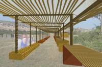
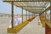
Red Mark Set
1. 2.
2. 
1. Before I get to much farther with this I wanted to see what you guys think. The new perspective brings up a couple of things: 1. There is a lot of space on the right side of the image (that's why I chose to work with the site photo with the tree) 2. The soccer goal and bench seem so far away. 3. The water tanks are going to be really really tiny (ps. the color block delete also deleted the back wall).
 2.
2. 
1. Before I get to much farther with this I wanted to see what you guys think. The new perspective brings up a couple of things: 1. There is a lot of space on the right side of the image (that's why I chose to work with the site photo with the tree) 2. The soccer goal and bench seem so far away. 3. The water tanks are going to be really really tiny (ps. the color block delete also deleted the back wall).
2. Im looking for a soccer player and some mechandise for the table. Also do you guys think that the back ground sound be faded out more?


1 Comments:
I agree... I still have some more images to add. On the other hand I was affraid the image was becoming a bit to photoshop-y when I had more people in it. Any suggestions?
Post a Comment
<< Home